The Chart modal appears on both all main views (for both multiple events and single event reporting).
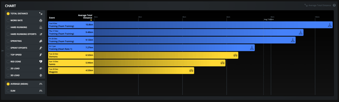
It is a great tool for comparing longitudinal metrics, identifying trends and planning athlete/team workloads.
Users can choose the specific metric that they want to view on the timeline, along with the aggregation method (average or sum). An average line will also appear in the chart to aid with further analysis.
It is worth noting that the selected metric will also be available to learn more about in the tool tip located on the top right hand side of the chart.
Here is an example of the chart view on the Team Timeline page.